Selected work
Dublin Is Home
Two organizations. One shared sense of home.
My role: Art Direction · Graphic Design · Branding · Social Media · Project Management

The City of Dublin and Dublin City Schools came together for the 2018 State of the Community event. They needed one visual identity to celebrate local achievements and introduce future plans—without losing either organization’s identity.
As the City’s graphic designer, I created a flexible system for event marketing, social media, presentation decks, signage, and print. My focus was to make the partnership feel like one community story.
Creative direction
Start with the people who call Dublin home.
Higher-quality photography had helped the City’s communications earn more engagement. I built on that direction with real community moments rather than an identity led only by institutional logos.
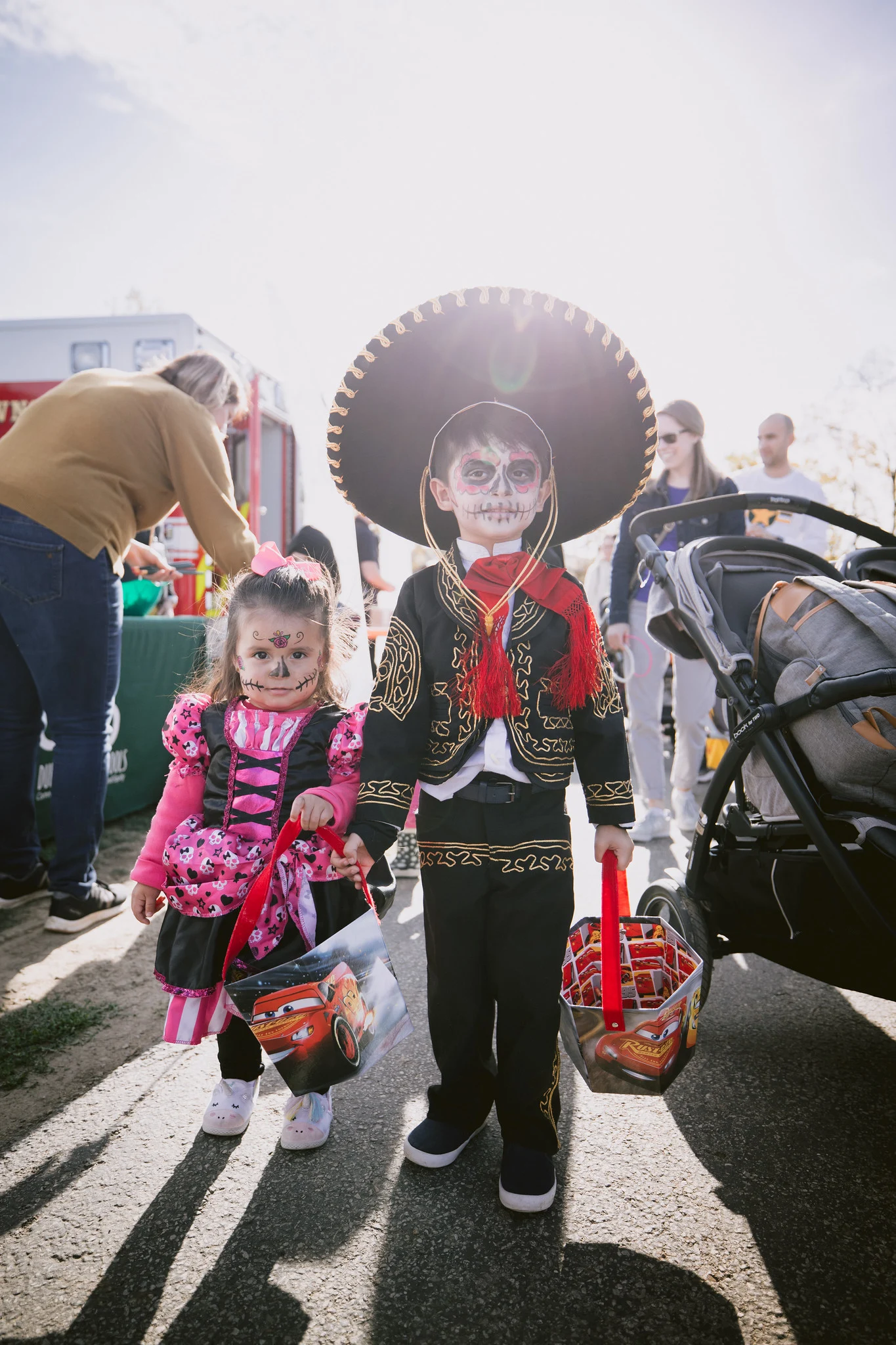
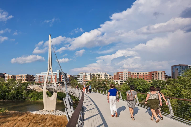


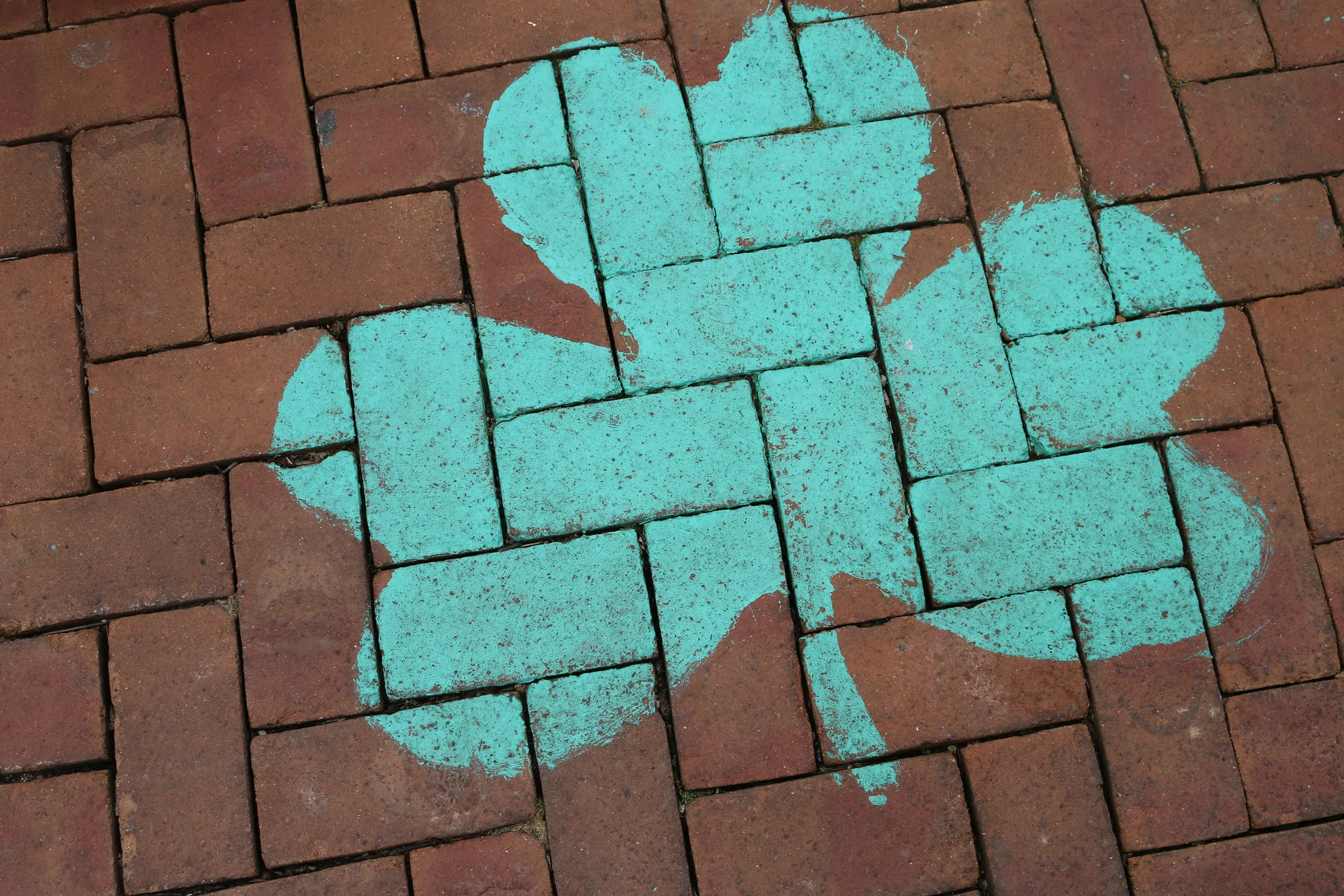

Keep both brands in the picture.
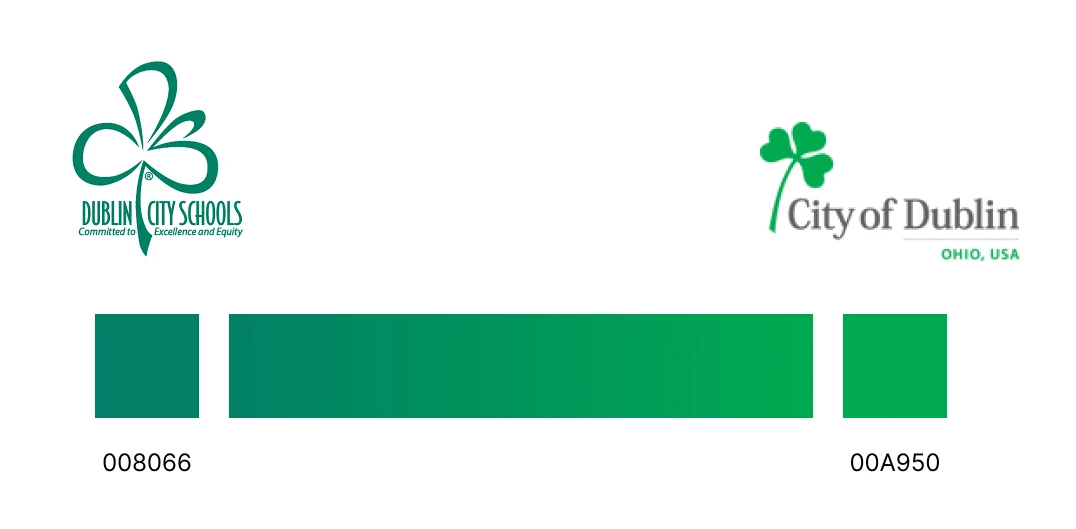
Each organization had its own green. Instead of choosing one over the other, I connected them with a gradient that gave both a place in the shared identity.
Make it feel personal, not institutional.
Dublin YPA student Aubrey Jones created the “Dublin Is Home” lettering. I incorporated her work with photo-print frames, clotheslines, and a wood-textured backdrop—a familiar, personal way to tell the community’s story.

The identity in use
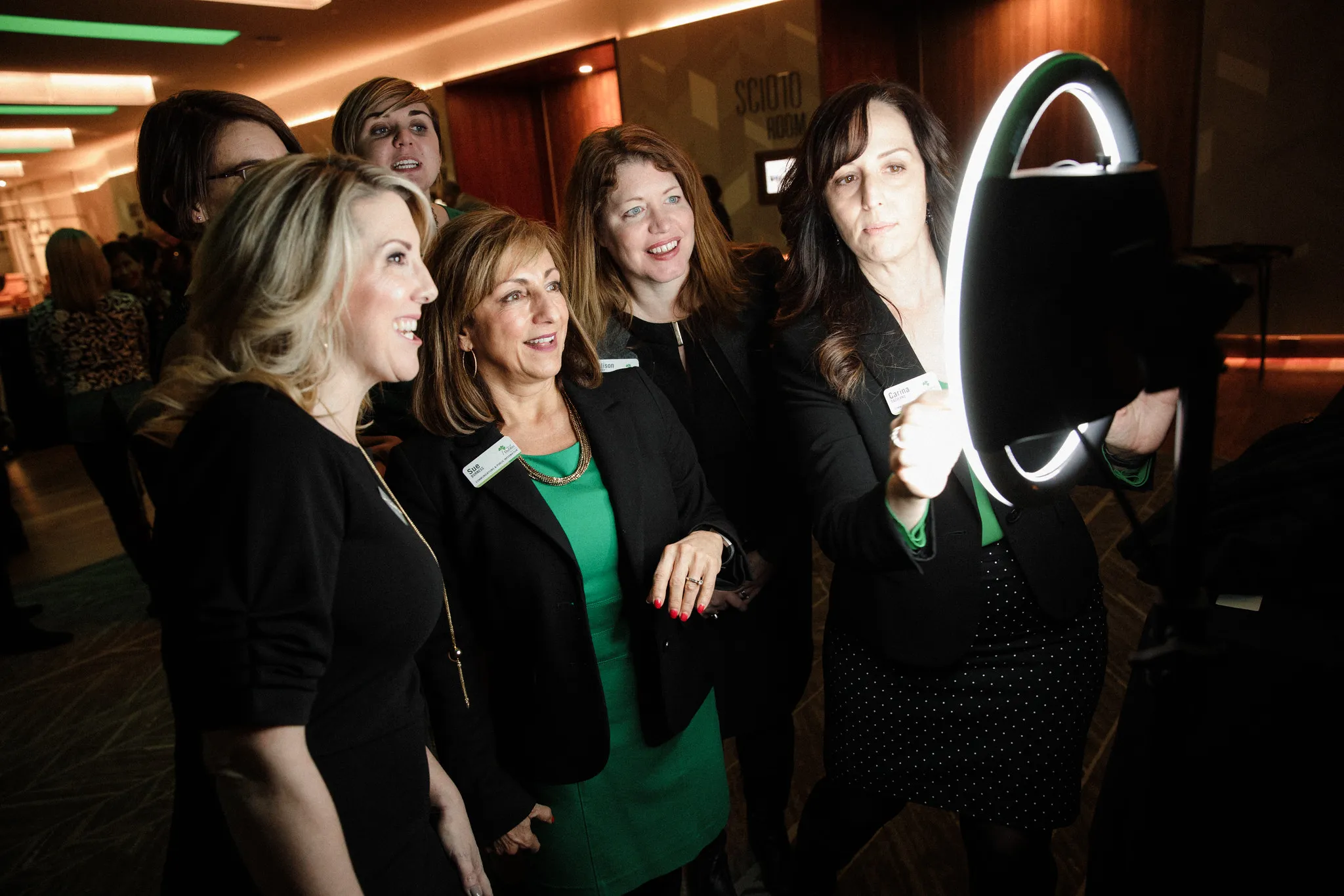
The same visual elements carried across the presentation, printed materials, photo display, and event experiences. Different images could be swapped in while the event still felt connected.
From the stage to the details.



The takeaway
One community story. Across every touchpoint.
The event brought together more than 300 attendees. My design work gave the City and school district a shared visual language—from the first invitation to the presentation and photo experiences at the event.
For the community, the identity put familiar people and places at the center. For both organizations, it offered a flexible way to communicate together while keeping their individual brands recognizable.